Yahoo Aviate for Android
Why does Yahoo think we need another launcher for Android? Well, the company certainly isn’t the only one with this idea. We showed you the Nokia’s Z Launcher not too long ago, and launchers are a cool and simple way of bringing people closer to certain services. However, Yahoo Aviate doesn’t include all of the Yahoo services you’d think. It is, however, a nice, simple and, most of all, different Android experience. Installation is easy, Get the free app from the Google Play Store, here. Now, before you can actually use Aviate, there is some setting up to be done. You start by picking up the apps you use most.
Then you pick the types of apps you use most.
Next, tap Always after selecting Aviate when asked about the home app you want used.
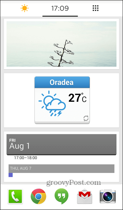
Aviate is now your home app and you can start enjoying it. Of course, you can always uninstall it and set back your previous home app. Now, let’t see what you get with Aviate. First of all, there’s a nice, clean home screen, which you can easily personalize with widgets and images. Just keep your finger pressed on the screen and you’ll be able to add what you want to it. The same method works for editing just about anything you don’t like in Aviate. This main layout has your favorite apps at the bottom and is the one you’ll probably be using the most.
Swipe up from the bottom of the screen and you’ll get access to both your favorite and recent contacts, which you can text or call.
Swipe left to right and you get an adaptive screen, which will adjust to your surroundings. It generally shows a Today screen like the one below.
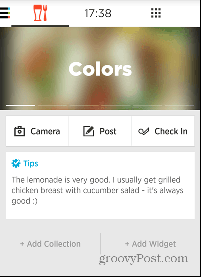
However, when you’re on the move, for example, it will show navigation options and when you’re near a restaurant you’ll get reviews and details (as seen below). If you tell it what your home and work locations are, you’ll get relevant content, too. Also, plugging in your headphones turns on what’s called the Listening Space, with the relevant apps.
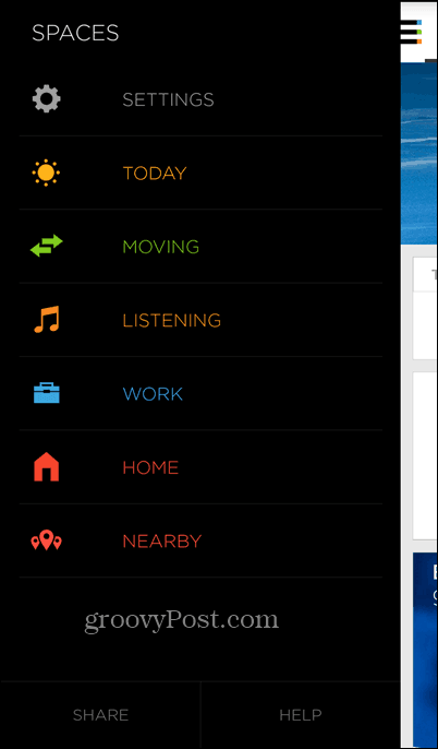
If you want access to any of those screens, as well as their options, just swipe all the way left.
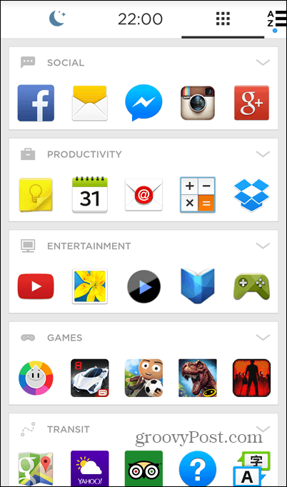
I know we’ve been swiping left quite a bit, now let’s swipe right. Doing so from the home screen will help you find out why you’ve picked apps and app types. They’ are organized in a cool fashion, so you can find things easier. Of course, you’re free to edit everything if you need to. You can also add categories, if needed.
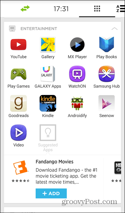
Tapping the arrow on the top right side of each category will show it in full and you’ll also get some useful new app suggestions.
If you swipe as far right as you can, your full list of apps can be seen and used.
Yahoo has provided users with a video detailing some of the features of Aviate. You can watch it below.
Bottom line
Yahoo’s launcher does provide an interesting Android experience and it’s quite easy to get used to. If you’re invested in Yahoo services, you’ll find this to be a nice launcher, or if you aren’t it still provides a fresh and unique experiences. What is your take? Have you used the Yahoo Aviate launcher on your Android device? If so, leave us a comment and let us know what you think. The new UI now seems to be pretty neat. I will definitely try it again… Thanks for the detailed article!!! Comment Name * Email *
Δ Save my name and email and send me emails as new comments are made to this post.


