The new modern interface in the OS is optimized for use on a tablet or touch screen. While that’s great on a touch device, it’s not well suited for a traditional PC with a keyboard and mouse. But, you can stay in the desktop as much as you like. I’ve been using Windows 8 for the past year through its various stages of development, and currently I use it full time on my main production box. In fact, I have it installed on all of my PCs now, and when I go back to Windows 7, it seems dated. Microsoft has added a lot of awesome new functionality to the desktop in Windows 8 and that’s been severely overlooked by the media. It has enhanced security, stability and runs much faster. It has gained new features like: File History, PC Reset, PC Refresh, Storage Spaces, SkyDrive integration and more. I agree that the company would have been wiser to make the tile based UI more of a background feature on traditional laptop and desktop computers. Apple has the right idea with OS X on its Macs. While the company is merging iOS and OS X, the iOS type features aren’t the first thing you see when you fire up a Mac. Instead it’s the desktop like you’d expect and you can go to the LaunchPad for a mobile feel if you want. I challenge anyone to find a version of Windows that’s perfect out of the box. It has never happened. And the beauty of Windows is that you have the ability to customize it to work best for you. Whether using built-in setting tweaks or third party software, you can get what you need from the new OS. Here’s some tips on getting rid of a few annoyances in Windows 8 and make it easier to use.
Get the Start Menu Back
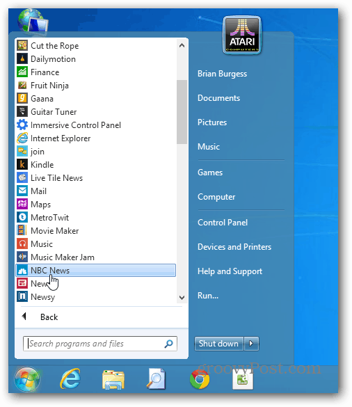
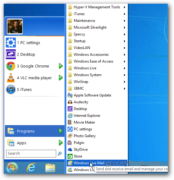
The biggest complaint people have is that there isn’t a Start menu. While there isn’t the traditional button in the lower left corner that you’re used to – you can get the same type of functionality from the hidden power user menu and Start screen. Once you get used to it, and it doesn’t take long, you’ll discover that it’s actually quite efficient. But I digress, you want the good old Start Menu back – here’s a couple of simple solutions. StarDock’s Start8 This is my favorite Start Menu replacement for Windows 8. It’s a meager $4.99 and it provides the same functionality as the Windows 7 menu and more. Plus it lets you boot directly into the desktop every time you turn your machine on or reboot. If you want the best of bother worlds, you can set it to interact with the new Start screen too.
Classic Shell If you want a free and Open Source solution, grab the Classic Shell utility from SourceForge. Not only does it bring back the Start Menu functionality, it’s highly customizable. You can make the menu look like Windows 7, Vista, XP. You can also set it to bypass the new Start screen and boot directly into the desktop.
Stay in the Traditional Desktop Environment
Windows 8 is set to have your photos, music, PDFs and video files open in its new apps. It will also open email links in the Mail app. On a traditional PC, you want to get things done and not bounce around between the desktop and modern UI. To stay on the desktop environment as much as possible, you’ll need to change file associations so files launch in desktop programs. Changing this easy, and we have you covered with the following articles.
Make PDFs and Pictures Open on the DesktopMake Music and Video Open in Desktop ProgramsChange the Default Email Client in Windows 8
The easiest way is to change all file associations in one shot by going to the Control Panel » Default Programs. Then select the “Associate File Types with a Program” link and set your files to open in desktop programs.
Keyboard Shortcuts are Your Friend
There’s nothing more important to learn in this version of Windows than keyboard shortcuts. Check out our Windows 8 keyboard Shortcuts Guide.
If there’s something you’re wondering how to do in Windows 8, make sure to check out our Complete Guide to Windows 8. I recommend booking marking it as we’re updating it regularly. The new Windows Start Screen however for me is a waste of time being that I’m on a laptop/desktop with no touchscreen interface. In my case, I would be happy with no app launcher and just a search box…. but that’s just me. I do the same thing on my ipad. I swipe to the left, search for the app I want and then launch it…. Search for the WIN! The two main gripes I’ve noticed immediately is that many of the apps lack the functionality of going via the browser, ebay/hotmail being two examples and the app is too basic. Secondly it seems utterly ludicrous not to have a obvious ‘lock’ option on the metro tiles. Move one and you get a chinese puzzle movearound shuffle. Having a ‘lock tile to metro’ option on the right click menu of a tile, so the tile stays put seems a basic thing to think of that appears missed or just ignored by microsoft. The time/irritation spent moving tiles back, and back again when they are repositioned, and back again when the next tile is repositioned hardly seems like a feature to grap a customers delight by the short and curlies. Comment Name * Email *
Δ Save my name and email and send me emails as new comments are made to this post.


