Features and Tech Specs
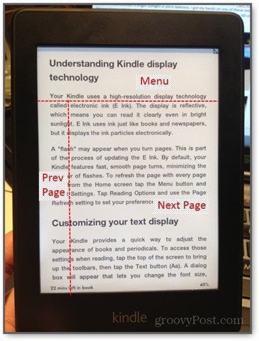
The Kindle Paperwhite controls and interface consists of a capacitive touchscreen, a sleep/power button and a microUSB port and that’s it. Navigation is done through touch and gestures, including two point multi touch gestures, swipe for scrolling, and long presses for contextual menus. When you’re reading a book, there are a several tap zones. The biggest is in the “next” page zone, which takes up much of the bottom-right quadrant. A smaller zone is on the left edge, which lets you go back a page. Tap along the top to display the menu. You can also swipe left and right to turn pages.
Kindle Paperwhite: What’s Groovy
Kindle Features
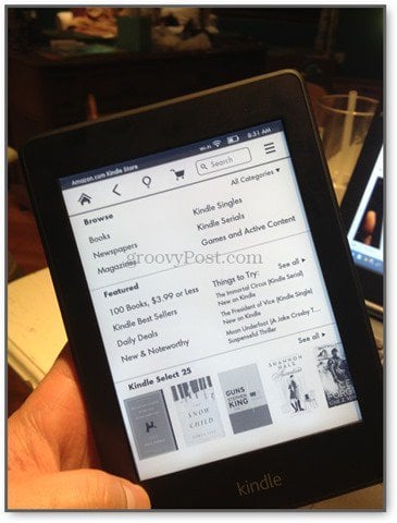
Aside from the shopping experience, I enjoy the Go To menu, which let’s you explore the contents of the book by section, such as chapters, table of contents, pages and locations and other parts of the book.
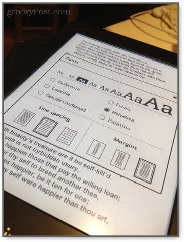
The ability to change the font size and line spacing is another excellent, though basic, feature. You can even choose from six different fonts, including the much beloved Helvetica.
Bookmarking, highlighting and note-taking is also very nice. You can bookmark by tapping the upper-right corner of the page. To take notes, you can highlight a word or passage and choose from the contextual menu. There’s also a built-in dictionary, Wikipedia search, Facebook integration (in case you want to share an inspirational passage) and the X-Ray feature. Kindle X-Ray, which is exclusive to Kindle devices, shows you the “Bones of the Book,” such as character bios, passages relevant to a given theme, and other crib notes. I’ve yet to read a book that had X-Ray content, so I can’t comment on its usefulness.
Another recent feature introduced by Kindle is WhisperSync. This synchronizes your page location across all of your devices. So, you can read a few pages on the bus using your smartphone, and then pick up your Kindle at home and pick up where you left off. Those are the highlights. There are various other sundries that enhance the reading and content management experience on the Kindle, none of which feel superfluous or obtrusive. Innovative Illumination When you look at a computer screen or backlit tablet, you are essentially staring at a light bulb for hours at a time. While there’s no hard science saying that staring at a glowing screen in the pitch dark causes permanent damage, enough users have complained about “eyestrain” to make it a household world. The Kindle Paperwhite attempts to mitigate the straining effects of staring at an illuminated screen by using a patented built-in light that is not a backlight. Instead, light is distributed across the surface of the screen via a “nanoimprinted light guide” that overlays the reading surface, so the light is shining at the screen, rather than your face.
Overall, I dig the Paperwhite’s built-in light. Unlike some smartphones, the lowest setting is dim enough to read in bed with the lights out without lighting up the whole room. Handy Form Factor This is my favorite part of the Kindle. This may sound stupid, but a big reason why I avoid reading certain books is the awkwardness of the affair—keeping my page, holding it open, propping it up in a readable position if I’m reclining or at a desktop. When it comes to reading any book of significant heft, I’m like the “before” guy in infomercials, who can’t open a carton of milk without soaking my cardigan and setting the curtains on fire. Laugh if you want, but I know I’m not the only one.
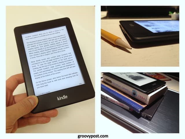
Bibliophiles will revile me for saying so, but the Kindle Paperwhite is a vast improvement on the hardcopy book. The reading area is about the size of a paperback novel page, and the rest of it is barely there. It’s thin as a pencil and light as a feather, which makes it easy to slip into a pocket or toss into a bag. Even with a case on it, the Paperwhite can be held with one hand and still leave your thumb free to turn pages (which can be done without swiping). When holding the Paperwhite in my hand in a dark room, I’m barely aware of anything other than the words I’m reading. And that’s the point of any multimedia device. Epic Battery Life
So, why did I choose the Paperwhite over the Fire HD? Because I’m easily distracted. I want a device that can deliver me books and periodicals without the temptation to browse the web or check my email. With the Paperwhite, it’s all about the books. As for turning wireless off, I don’t think it’s particularly worth it to squeeze out a few more days of battery life. The Kindle spends most of it’s time asleep, during which time it uses just about no battery power regardless of whether WiFi is turned on or off. Around the house, the battery life is a perk. But on the road, the Kindle’s nearly endless battery life would be a godsend.
Free Kindle Books
Kindle Paperwhite: What’s Lacking
There’s very little with the Kindle Paperwhite that I consider a design flaw. The drawbacks that I have encountered with the Paperwhite only appear when you compare it to other devices, such as the Kindle Fire HD or previous versions of the Kindle. I see these as design choices, rather than shortcomings. The Kindle Paperwhite is a narrowly tailored device, and that’s where much of its strength lies. Still, depending on what you value your Kindle for, you may be disappointed by what made the cut. There Are Ads
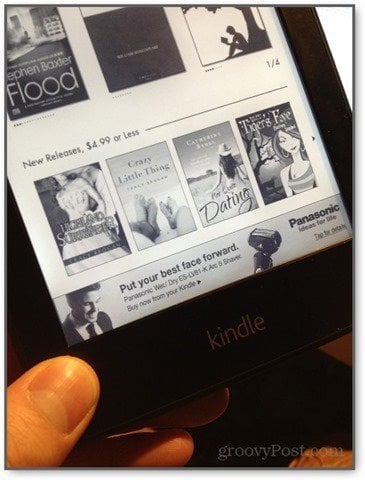
For the most part, the ads are relevant (mostly books, as you can imagine) and low-key. I have had the occasional non-book related ad, such as one for a Panasonic wet/dry shaver. But there hasn’t been anything that I’d be embarrassed for someone to see laying on my coffee table.
In spite of how non-annoying the ads are, I think $20 is a small price to pay for an ad-free device. Down the road, I may regret not plunking down the extra cash. But for now, I really don’t mind them. I feel like the offers may actually steer me toward a book I want to read. E Ink Touchscreen Takes Getting Used To The glorious glass capacitive touchscreen on the iPhone and the iPad have spoiled me immensely. If navigating and typing on an iOS device is as smooth as glass, then doing the same on a Kindle Paperwhite is a bit more like trudging through sand. I often find myself missing or fatfingering when navigating a table of contents on the Paperwhite, whereas I never have that problem on the iOS Kindle App. The necessarily slower refresh rate on the Kindle’s E Ink screen also gives a distinct sense of slowness and unresponsiveness compared to a traditional tablet touchscreen as well. The “flash” that you see whenever the E Ink screen refreshes is jarring at first, too. In addition to poor precision, there’s little feedback as to what you are pressing. Although the Paperwhite uses familiar swipe motions and long presses, you don’t get the smooth scrolling and transitions that help you stay oriented when using a tablet. For example, when paging down in a PDF on the Kindle, I easily lose my place, since the reading position “jumps” down a chunk, rather than scrolling upwards as a swipe.
This, of course, is a limitation of the technology and not of design. I recognize that I am being a bit unfair, since comparing a tablet touchscreen to an e-reader touchscreen is as apples vs. oranges as you can get. I haven’t had an opportunity to try any other E Ink readers, so I don’t have much insight on how the Paperwhite compares to say, the Nook. In spite of all that, I will say that the Kindle Paperwhite’s touchscreen interface is suitable for its primary use. With a Paperwhite, you should mostly be reading book length texts, only needing to tap every few minutes to turn a page or add a bookmark. You won’t be clicking hyperlinks or playing games on the Paperwhite, so the lack of responsiveness isn’t much of a disadvantage. But for highlighting and note taking, I will say that an iPad or a Kindle Fire would probably be a better device. Paperwhite Illumination Isn’t Perfect
No Audio Previous versions of the Kindle came with headphone jacks and/or speakers that let you listen to audiobooks or use the text-to-speech feature for reading traditional Kindle books aloud. The Paperwhite has no feature. If you loved the text-to-speech Kindle functionality in the past, you’ll miss it on the Paperwhite.
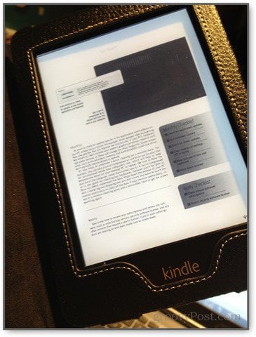
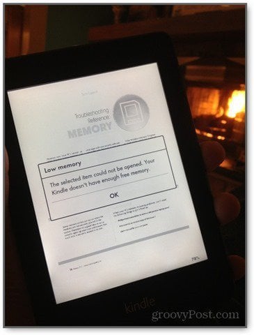
Magazines, PDFs, and Websites Don’t Look Great The Kindle Paperwhite is made for reading text. You can subscribe to magazines or browse through PDFs on your E Ink Kindle, but the experience is severely lacking. With an iPad, you get a full color experience, with the ability to seamlessly zoom in and out and pan around the page to get the full visual of the page layout. But with the Kindle, any attempts at graphic design are lost. I tried reading a PDF of Smart Computing on my Kindle Paperwhite, and I wasn’t able to read the text without zooming in. The pages broke at such odd places that I found it hard to read through a two-page spread without getting distracted or frustrated. There was even a point where the Kindle ran out of memory and booted me out of the PDF altogether.
Likewise, the Kindle Paperwhite does have an experimental web browser built-in. But it’s not really worth your time. Pages render in a very pared down form, and navigating links and menus isn’t very precise or intuitive.
I consider this a minor drawback, however. If I had wanted to view full color pages with beautiful HD graphics and scintillating designs, I would’ve bought a Kindle Fire or an iPad. Displaying PDFs, images and magazines are akin to the Kindle Paperwhite’s second language. I bought the Kindle Paperwhite to read novels, and it performs that task fluently.
Conclusion
Do you own a Paperwhite or another Kindle device? Let us know your thoughts, reactions and experiences in the comments. Comment Name * Email *
Δ Save my name and email and send me emails as new comments are made to this post.
